Through an idea that lead to a web search that lead to another web
search that lead to an idea, I stumbled upon Rudolph Wittkower's
wonderful book, Architectural Principles in the Age of Humanism. I
wish I had found it sooner. Wittkower's ability to articulate the
humanists' take on classical geometry is unparalleled and his extended
discussion of the architectural symbolism of the circle is something I
could read every day, aloud, like a chant. In the book's second part, Alberti's Approach to Antiquity in Architecture, Wittkower says of Alberti's first ecclesiastical architectural work, San Francesco in Rimini (aka Il Tempio Malatestiano):
To
bury people under the arches of the exterior of a church was actually a
mediaeval custom; examples are numerous and were well known to Alberti.
The tombs planned for the façade and the side fronts of S. Francesco
derive from such mediaeval models. But by placing sarcophagi with
classically styled inscriptions under serene Roman arches Alberti
created an impressive pantheon for heroes rather than a burial-ground
with its traditional funereal associations.
If
we parse Wittkower's paragraph, what he is actually saying is that the
decisive difference between Alberti's first church and medieval ones is the style of lettering on the inscriptions, which
effectively transform a graveyard into a pantheon. Medieval Italian
churches abound with sarcophagi, or noted graves at least, under "serene
Roman arches;" their choice of surface treatment differed from
Alberti's but the over all architectural style is the same. The
lettering on S. Francesco provides the transfigurative graphic content
of the work, elevating an earthy medieval model to the reserved example
of a new style.
From the standpoint of lettering
history, San Francesco figures prominently in the (endless, tiring)
debate over who in the Renaissance first made letters that approximated
classical ones. Built as a vanity project for Sigismondo Malatesta in
the 1450s and 60s, only the exterior of S. Francesco can be attributed
to Alberti. Which is fine because the exterior is where all the faux
classical lettering appears. The building itself, as Wittkower implies,
only hints at Alberti's mature architectural vision, but the
inscriptions are a clarion call for the coming generation. They place
Alberti firmly in the company of Andrea Mantegna and Felice Feliciano,
two other potential Adams in the creation myth of humanist lettering.
You
may have guessed that I am not terribly interested in who first made
classically inspired letters. History just doesn't happen that way.
There is no Adam or, if there is, there is only one and he is long dead.
Everything else is swept up in the
zeitgeist of generational change. To suggest that the greatest architect
of the Quattrocento borrowed ideas (from Vitruvius) and style (from the
middle ages) but that he (or Mantegna or Feliciano for that matter)
somehow produced ex nihilo the lettering of the
modern age is absurd. Further, to place such emphasis on the Patient X
of a revival of a millennium-old lettering style is to discount the
millennium of lettering that interposed the two exemplars. To
disassociate Alberti's inscriptions on San Fracnesco from medieval
examples such as those on the Duomo of Salerno (1081), Santi Giovanni e Paolo al Celio (1150s), or San Giorgio in
Velabro (first half of the 13th century) is to miss out on the
true grist of creation: the friction and dialogue between generations,
the revival and rejection that defines and energizes new styles.
Somehow, this relates to Euclid.
Saturday, March 16, 2013
Thursday, March 7, 2013
Book V, Book V
I have spent the day working through the propositions in Book V of Euclid's The Elements. Augustus De Morgan says of the book's opening propositions that they are "simple propositions of concrete arithmetic, covered in language which makes them unintelligible to modern ears. The first, for instance, states no more than that ten acres and ten roods make ten times as much as one acre and one rood." To give you an idea of what De Morgan means by the book's unintelligible language, here is Heath's translation of the enunciation of Proposition V.1 If there be any number of magnitudes whatever which are, respectively, equimultiples of any magnitudes equal in multitude, then, whatever multiple one of the magnitudes is of one, that multiple also will all be of all. Once you sit down with the diagram and the text of the proof, these propositions are easy to work through. They are, after all, just as simple as De Morgan says. But the enunciations of the book's twenty-five propositions—the opening bits of text that tell you what the proposition is setting out to prove—are just as opaque as that of the first.
Among historic editions of Euclid, the illustrated printings are most famous but there were many beautiful editions printed in the Renaissance that contained only the enunciations—no diagrams, no proofs or conclusions. Antonio Blado printed at least two such editions, one in Greek, one in Latin. (Blado had a penchant for printing lists; the lists of banned books that he printed for the Vatican are models of typographic ingenuity.) Blado's Euclids are exquisite little pocket books, indispensable calling cards for the cosmopolitan humanist. One can only imagine the excruciating difficulty by which these books were attended. Imagine sitting down at your desk and trying to parse a proof for the proposition I quoted above, using only the enunciation. It makes me wonder how many owners of Blado's books pitched themselves head first out of their library windows in frustration.
The enunciations are not impossible to parse, of course, and once you immerse yourself in the language of Euclid his obscure geo-babble shines with an eerie legibility; but they are meant to be illustrated—by their readers if not by their printers. The diagrams that accompany each proposition are not illustrations, they are text. To properly understand Euclid you have to draw them. This singular quality of The Elements, that it is a text equally reliant upon image and language, sets it apart as a model for the contemporary artist book.
Among historic editions of Euclid, the illustrated printings are most famous but there were many beautiful editions printed in the Renaissance that contained only the enunciations—no diagrams, no proofs or conclusions. Antonio Blado printed at least two such editions, one in Greek, one in Latin. (Blado had a penchant for printing lists; the lists of banned books that he printed for the Vatican are models of typographic ingenuity.) Blado's Euclids are exquisite little pocket books, indispensable calling cards for the cosmopolitan humanist. One can only imagine the excruciating difficulty by which these books were attended. Imagine sitting down at your desk and trying to parse a proof for the proposition I quoted above, using only the enunciation. It makes me wonder how many owners of Blado's books pitched themselves head first out of their library windows in frustration.
The enunciations are not impossible to parse, of course, and once you immerse yourself in the language of Euclid his obscure geo-babble shines with an eerie legibility; but they are meant to be illustrated—by their readers if not by their printers. The diagrams that accompany each proposition are not illustrations, they are text. To properly understand Euclid you have to draw them. This singular quality of The Elements, that it is a text equally reliant upon image and language, sets it apart as a model for the contemporary artist book.

Friday, March 1, 2013
Interstices & Intersections in Progress
It has been a busy week of working on Interstices & Intersections. On Monday, 5,000 sheets of paper for the standard edition (all 1,320lbs worth) arrived from Germany, filling every available shelf and the entire surface of one of my two work tables. This morning Travis Becker at Twinrocker Handmade Paper made the first trial batch of paper for the deluxe edition. Travis is trying to create a paper that has similar qualities to one I made with Mina Takahashi on her farm last Spring. Between these two paper events I have been steadily working my way through the 115 proofs of the first four books of Euclid—drawing each proof, writing the Euclidean enunciation beneath it, and painting a title page for each volume of my Euclid notebooks as I go. I have settled on which proposition I will annotate from each of the first four books. Only 325 more proofs to go before all thirteen propositions are chosen.
 The title pages for the first four volumes of my Euclid notebook, spread out on 1,000 of Zerkall paper.

Friday, February 22, 2013
Back from CODEX, Back to Work
After another exhilarating CODEX International Book Fair & Symposium, I am slowly easing back into the studio. 4,000 of the 5,000 sheets of paper for the standard edition of Interstices & Intersections arrive on Monday and I am continuing with the drawing of all 450 of Euclid's proofs. For this purpose I have had pale gray graphs printed on 90lb watercolor paper. I will be drawing the proofs in four page imposition so that they can eventually be bound into 13 volumes for easy reference. Here's a look at the loose title page of volume one.


Sunday, January 13, 2013
Interstices & Intersections
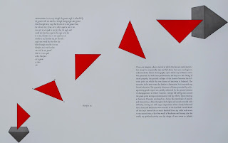
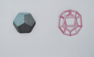
In the frantic run-up to the CODEX Book Fair and Symposium, I have been proofing some early spreads from my upcoming Euclid book. In the process I have been tossing around some possible title ideas. Serious contenders thus far have been "Therefore Etc.," "Extreme and Mean," "Syllogisms," and "Euclid Avenue." For the time being I have settled on: Interstices & Intersections or, An Autodidact Comprehends a Cube. Below are samples of what I have done so far, representing Propositions i.19; iii.1; iv.6; and xiii.17. (The large blank spaces are where as-yet-unwritten text will go.) Keep in mind that these are early proofs from a project that has another year, at least, yet in the making, so anything is open to change during that time. Tomorrow I will bring the sheets up to Daniel Kelm in Easthampton, Massachusetts so that he can bind a mock-up for the fair.





Tuesday, December 18, 2012
Thirteen Euclidean Propositions
I have begun work on a new project investigating and interacting with a selection of thirteen propositions from Euclid's Elements. Chosen not for their relationship to each other but for their relevance in my life, the thirteen propositions will be printed with accompanying diagrammatics and paired with a companion textual and visual commentary of my own. The book is in the very early stages of reading, sketching, writing, and proofing, but it already promises to involve the most complex printing I have attempted to date. The few spreads that I have designed so far require ten to fourteen press runs each, involving any number of materials and processes including hand set type, ornaments, rules, polymer plates, woodblock, and pochoir. The book will be hand set in my proprietary typefaces, Gremolata and Cancellaresca Milanese, newly engraved and cast by Micah Currier at the Dale Guild Type Foundry, and Daniel Kelm will be binding the book in a new structure of his design.
While many people develop a kind of nervous tick at the mention of geometry, flashing back to the schoolhouse frustrations typically associated with maths, the geometry classroom, above all others, was enormously creative for me. I was a disastrous student in general but in mathematical subjects I experienced a natural fluency, one that was tested when I entered tenth grade geometry. Frustrated with my incompetent teacher and my resulting grades, I took to reading the text book rather than paying attention in class. My grades and comprehension quickly improved and it soon became apparent that in geometry I had found my life's metier. I also discovered the method by which I would pursue any future studies: reading books and drawing. Since that first brush with geometry I have used what I learned in that text book to draw letters, design books, develop ornaments and patterns—all of the things that I love most to do.
My method for working on Thirteen Propositions is similar to my method in the tenth grade. I am beginning by reading and drawing proofs for all the propositions in Euclid's thirteen books. Along the way, certain propositions stand out as having a particular interest or relevance: they spark associations in literature, letter forms, or life (or all three). I then begin to develop visual ideas, write bits of text, and begin reading other books that might inspire or relate to the proposition at hand. My thought at this point is that each proposition will involve a work of Greek literature but it is too early to tell if that will be the case. While some of the reading is great fun, the Iliad, David Copperfield, Edith Hamilton, Euclid, etc., some is less thrilling. Just a few days ago I received a copy of a ninth grade algebra text book that sent strange shivers through my body, an uncomfortable electrical current connecting me with my awkward thirteen year old self. Thankfully, I am able to read through a chapter a day, meaning that it will be a quick torture. There are only fourteen chapters.

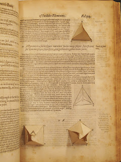
Simultaneously with these studies, I am conducting a survey of a few hundred editions of Euclid, beginning with Erhardt Ratdolt's edition of 1482 and ending with editions from the last few years. For those of you who are unfamiliar with the structure of the Elements, there are thirteen books comprising roughly twenty to fifty propositions. Each of the propositions begins with an enunciation of what is meant to be proven, followed by the proof and conclusion which are illustrated by a line diagram. These diagrams have remained constant for hundreds of years and so it is interesting to see how designers and printers have tried to distinguish their edition from others—you can tell instantly if the printer had fun with geometry or took it a little too seriously. Below I've attached just two examples. The first is from Paganius Paganinus' 1509 edition edited by Fra Luca Pacioli and it is pretty much exactly what one would expect from a Humanistic friar: tall slender columns of uninterupted text with the squares, trapezia, etc. tucked safely in the margins. The second is published by John Daye in London in 1590, showing his lovely little pull-up illustrations from Book XI. Daye's is closer to the spirit which I will try to evoke in my edition.

While many people develop a kind of nervous tick at the mention of geometry, flashing back to the schoolhouse frustrations typically associated with maths, the geometry classroom, above all others, was enormously creative for me. I was a disastrous student in general but in mathematical subjects I experienced a natural fluency, one that was tested when I entered tenth grade geometry. Frustrated with my incompetent teacher and my resulting grades, I took to reading the text book rather than paying attention in class. My grades and comprehension quickly improved and it soon became apparent that in geometry I had found my life's metier. I also discovered the method by which I would pursue any future studies: reading books and drawing. Since that first brush with geometry I have used what I learned in that text book to draw letters, design books, develop ornaments and patterns—all of the things that I love most to do.
My method for working on Thirteen Propositions is similar to my method in the tenth grade. I am beginning by reading and drawing proofs for all the propositions in Euclid's thirteen books. Along the way, certain propositions stand out as having a particular interest or relevance: they spark associations in literature, letter forms, or life (or all three). I then begin to develop visual ideas, write bits of text, and begin reading other books that might inspire or relate to the proposition at hand. My thought at this point is that each proposition will involve a work of Greek literature but it is too early to tell if that will be the case. While some of the reading is great fun, the Iliad, David Copperfield, Edith Hamilton, Euclid, etc., some is less thrilling. Just a few days ago I received a copy of a ninth grade algebra text book that sent strange shivers through my body, an uncomfortable electrical current connecting me with my awkward thirteen year old self. Thankfully, I am able to read through a chapter a day, meaning that it will be a quick torture. There are only fourteen chapters.

Simultaneously with these studies, I am conducting a survey of a few hundred editions of Euclid, beginning with Erhardt Ratdolt's edition of 1482 and ending with editions from the last few years. For those of you who are unfamiliar with the structure of the Elements, there are thirteen books comprising roughly twenty to fifty propositions. Each of the propositions begins with an enunciation of what is meant to be proven, followed by the proof and conclusion which are illustrated by a line diagram. These diagrams have remained constant for hundreds of years and so it is interesting to see how designers and printers have tried to distinguish their edition from others—you can tell instantly if the printer had fun with geometry or took it a little too seriously. Below I've attached just two examples. The first is from Paganius Paganinus' 1509 edition edited by Fra Luca Pacioli and it is pretty much exactly what one would expect from a Humanistic friar: tall slender columns of uninterupted text with the squares, trapezia, etc. tucked safely in the margins. The second is published by John Daye in London in 1590, showing his lovely little pull-up illustrations from Book XI. Daye's is closer to the spirit which I will try to evoke in my edition.


Monday, December 10, 2012
A preview of what's in the works

I will be announcing the book more formally in a couple of months but in the meantime here is a preview from the sketching/proofing phase of my upcoming collaboration with Euclid.
Subscribe to:
Posts (Atom)


