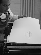
Wednesday, October 12, 2016

Announcing a New Book: Ornamental Digressions

In 2011 Joe Whitlock-Blundell asked me to design the binding for The Folio Society’s edition of The Sound and the Fury. Joe had liked the patterned paper I designed for Specimens of Diverse Characters and he asked me to emulate it for the Faulkner. In response I designed nine ornamental variations on a basic theme: a central pinwheel form with nine different fillers among the pinwheel’s arms. Joe chose the busiest of the nine designs as appropriate to the content of his book, and I spent a couple of years thinking about what else to do with the remaining ornaments. Eventually I decided to make a book of patterned papers, and I sent one of the designs, now called Pinwheel Ornaments, to Ed Rayher to have it made into new metal type ornaments.
 While the type was being made I began the obsessive process of designing ornamental patterns. I do most of this kind of work while lying awake in bed, and this time was no different. For months I worked out meticulous variations in the wee hours, unsure as to whether I would model the book on a type specimen, printing the designs in black ink on white paper, or on a fabric swatch book, printing the patterns in colors on a variety of papers.
 The more I thought about these patterns the more I realized that my mind was wandering. I love making patterns, but a book that only explored the patterning potential of the ornaments was not holding my interest. Instead, I began envisioning elaborate arrangements that were not inspired by what the ornaments could do but by what they were not supposed to do. While reading or walking around the city, texts and images would spark ideas for designs that made no practical sense at all, and my thoughts would digress into designs of eight, or nine, or more colors.
 The book that has developed, Ornamental Digressions, draws on all of these various sources. It begins with four black and gray designs that display the basic functions of the ornaments. This is followed by fifteen ornamental digressions, each of which is paired with a text and printed in a wide array of colors. The book ends with notes on the sources of the fifteen digressions. Additionally, twenty copies are accompanied by a swatch book of twenty patterned papers that are printed on variously colored handmade paper.
 The first sample bindings have arrived from Craig Jensen at Book Lab II, and copies will begin shipping this week. Below are some photos of the book and the process of making it. 

 Spine of the deluxe (left) and standard boxes.
 
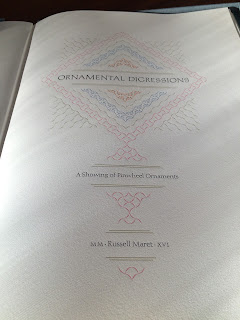
 Title page.
 
Title page of Pinwheel Papers, the companion volume of patterned papers.

 Some of the patterned papers accompanying the deluxe copies.
 
 Celine Lombardi and Nancy Loeber tipping-in the patterned papers.
 
  Color map and type formes for the Shakespeare page.

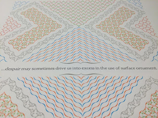
  Close up of the image for Shakespeare's passage "...ornament is but the guilèd shore to a most dangerous sea."

 Another close up of the same image.

 A type forme and partial print of the William Morris page.

 Close up of the William Morris page.

 A type forme from the Henry James page.

 A type forme from the D. R. Hay page.

 A type forme from the Caleb Stower page.

 Separating the colors for the Man'yoshu page.

 The disastrous pile of type awaiting distribution.

Friday, June 3, 2016

Hungry Dutch: A Typographic Adventure

Last summer I visited Phil Abel and Nick Gill at Hand & Eye Letterpress in London. After lunch, Nick and I got to talking about the feasibility of making a new typeface for Monotype composition casting. Nick had been studying the finer points of typefounding at the Type Archive in south London and he had been unable to locate one specific piece of information that would make a new composition face possible: he could not find detailed instructions for the creation of patterns for the pantographic punchcutting machine used by Monotype. Unlike direct matrix engraving processes in which a letter’s fit and alignment can be determined after the engraving, the Monotype process requires each letter’s fit and alignment to be figured out in advance. Those calculations are manifest in the pattern used to engrave punches, and they are followed through to the punch, the matrix, and the final piece of type. If the letterform is not in the right place on the pattern, in other words, it will never be in the right place on the piece of type. The trick is in figuring out the specific relationship between the pattern and the resulting piece of type, and the literature on this relationship is lacking. Intrigued, I lightheartedly suggested that we try to figure it out—Why not?—and Nick and I agreed that he would discuss it with Duncan Avery at the Type Archive and get back to me.

 A few months later I was back in London for a meeting at the Type Archive. In the time that had passed since our discussion at Hand & Eye, Nick had assembled an impressive, multi-generational group of collaborators to assess the feasibility of the project and, hopefully, to figure out the missing pattern information. The assembled group included Duncan Avery, who worked for Monotype from 1945 until 1992, at which point he initiated the Type Museum; Graham Sheppard, whose tenure at Monotype spanned 1952–1995 and included work in the Type Drawing and Type Development Groups; Parminder Kumar Rajput, who began at Monotype in 1965 and is now the only person qualified to operate every machine used in the production of matrices; Doug Ellis, who began as an apprentice at Monotype in 1955 before eventually becoming foreman of the Monotype Toolroom in 1991; Thomas Mayo, a printer who has been making a name for himself through his innovative use of laser cutting, the technology he will use to cut the patterns for our type; and finally Nick himself, a printer and typefounder who is the only person other than Kumar Rajput qualified to cut punches and make matrices for Monotype Composition Casters.

 After a brief tour of the Type Archive’s facility, we found ourselves in front of the punchcutting machine where Nick and I were hoping to begin the long, arduous process of discovering the missing pattern measurements. Kumar pointed out the various parts and functions of the punchcutter for my benefit and then Nick posed the thousand dollar question: How do we figure out the relationship between the pattern and the piece of type? It is difficult in retrospect to capture the comedy of the ensuing exchange, but imagine our surprise when, rather than getting a long bibliography of hints and sources, Graham Sheppard chimed in from behind us with a list of precise measurements from the top of his head.  Sometimes all you need to do is ask the right person the right question. In an instant the focal point of the day changed from figuring out how to make a single piece of type to endeavoring to make a complete typeface, Hungry Dutch.

The job ticket, pattern, punch, matrix, type, and print from the "proof of concept" Hungry Dutch "H"

Since that meeting in October there have been many fits and starts. Discussing the abstract idea of type manufacture over lunch is quite different from actually manufacturing type, and my learning curve has been long and steep. But nearly six months to the day after our meeting at the Type Archive, Duncan Avery sent me a packet containing newly made type, matrix, punch, and pattern, all derived from my drawing of a letter H. The thrill of opening that packet is one that has no equivalent in my experience—in my hand was evidence of something I had assumed was utterly impossible.

 The thought that we might be able to manufacture new composition typefaces is almost too exciting to bear but the excitement is tempered by the enormity of the undertaking. At the current working schedule of the Type Archive, it is estimated that making Hungry Dutch would require nearly two years. It is not, in all honesty, a project that is likely to be completed. But completion is not always the most rewarding outcome of creative work. Instead, the process of making the new type is the aspect of the project that promises to bear the most enduring fruit. We are at a jump or fall moment in the history of this technology. The four men involved in the manufacture of the Hungry Dutch matrices—Duncan, Graham, Kumar, and Doug—are the brain trust of the Monotype Corporation. The only way to fully access the knowledge that they have acquired is by going through the process of manufacture with them. The only way we can preserve that knowledge is by documenting everything we can along the way.

 I propose to make this a communal endeavor. I will work with the Type Archive to go as far as we can, and to collect as much information as we can. I will print fun ephemera as we progress and, eventually, a book about the process. The first step it to make the thirteen “medial trial letters”—a, C, e, f, g, H, h, i, n, O, o, p, t—and proceed from there. What I am looking for are supporters who are willing to sponsor the making of a letter or two (or more), at a cost of $600 each. In exchange for your support you will receive a pattern, matrix, and piece of type for each letter you sponsor*; copies of all ephemera printed from the type; and a discount on the resulting book that I publish, in which you will be listed as a patron. This project is conceived as a typographic adventure, and, in the spirit of all real adventures, it is undertaken without a clear idea of what will result. All that is required is people who are willing to come along for the ride. If you would like to sponsor a letter, please email, call, or visit the “Books in Print” section of my website and click on HungryDutch

*An important part of this project is that we follow Monotype's in-house procedures as closely as possible. Those procedures necessitate the manufacture of what are called the thirteen "medial trial letters" before moving on to the full face. From these letters—a, C, e, f, g, H, h, i, n, O, o, p, t—the head of drawings, Graham Sheppard, and the head of punch cutting, Kumar Rajput, are able to glean the necessary information for production of the remaining letters. In the spirit of this project, I am reticent to promise sponsors that they will receive letters other than the initial thirteen. However, due to the response thus far it does seem certain that we will be able to go beyond them. So this is what I propose: choose your letter or letters from the thirteen medial letters: a, C, e, f, g, H, h, i, n, O, o, p, t. If you would prefer different letters, let me know and, if we get as far as making them, they will happily be yours.

Tuesday, May 24, 2016

Effie Gray page from Ornamental Digressions

In August 1848 Effie Gray arrived in Abbeville, France with her husband of four months, John Ruskin. While there, John scurried about measuring and drawing from dawn to dusk while Effie often found herself alone to take in the sights. It is easy to imagine that Effie's days in Abbeville were colored, if not dominated, by the shock and humiliation of their wedding night, and all the nights since, as it became clearer and clearer that something was seriously wrong with John. But whatever Effie's mental state during her time in Abbevile, she was particularly struck by the facade of the "the magnificent Cathedral of St. Wilfran," about which she wrote, "I was very much confounded with the mixture of the grand and the ridiculous in the whole scene..." Whether or not she was making an allusion to her marriage in this observation, and it is doubtful that she was, it is hard not to see some connection in retrospect. Being married to John Ruskin was nothing if not publicly grand and privately ridiculous.

In thinking about a design for Ornamental Digressions inspired by Effie's description of St. Wilfran, I wanted to make a design that would be part rose window, part carnival ride, and be printed in day-glo colors to raise the alarm: Warning! Get out while you can, Effie! I opted for a sixteen arm design because Why not?, and it would let me play with my extra-fancy angular lock-up furniture. The text was too long for a single line of type, so my first thought was to break it in two and place the design between the text.


The result was disappointing for two reasons: 1) the design appeared to be squished in a vice of the text and 2) the central section of the design felt unresolved. Each of the sixteen arms is composed of three spurs, and in the first proof the central spur of each arm is too short and the exterior spur too long. The central spur feels too far away from the center; the exterior spur too close to its neighbor.


Although the Pinwheel Ornament set includes 14 pieces, it clearly wasn't enough. The lovely concentric wave that was created by the longest spur of each arm was interrupted by the central and outer spurs being the wrong length. There was no option but to mortise some of the ornaments in half to correct the problem.


Here's the mortised type locked up in the forme.


Once printed, the central section felt much more cohesive. I also moved the design up on the page and brought both lines of text together at the bottom, separated by a day-glo orange Warning! rule.


Below is a close up of the print in sunlight to give a better idea of the colors, and a shot of one of the lock ups in my extra-fancy lock-up furniture.


Sunday, May 15, 2016

Announcing a new metal typeface: Baker

The first trial casting of my new metal typeface, Baker, has arrived from Swamp Press & Letterfoundry, where the matrices were engraved by Ed Rayher. After proofing the type, I am revising the short T, the S, and the Z, but we are nearly there. We now expect the type to be complete and ready to ship in July.

 A close-up of the first casting of Baker.

The type design is based on the late Republican inscription on the tomb of M. Vergilius Eurysaces, a contract baker in the first century BCE. The tomb is located just outside the Porta Maggiore in Rome. Its facade is notable as "a pure experiment in geometrical forms*," an experiment that is carried through to its letterforms. Few classical monuments are so modern in their design or so fully integrated in the design of their architecture and their lettering. The tomb appears to straddle millenia, or to exist outside of time altogether, a quality that is accentuated by its proximity to the comparatively fussy and rusticated Porta Maggiore.

A detail of the Baker's tomb, showing the geometrical facade and a section of the inscription.

Baker is a 24pt type. It consists of the twenty-six majuscules, a tall T and tall I (both cast on a  30pt body), the ten figures, period, comma, semi-colon, colon, exclamation, question, hyphen, en dash, single open quote, single closed quote/apostrophe, ampersand, dollar sign, and three center dots: a triangle-esque, a diamond, and a shadow circle (not pictured in the image below). The A, R, T, V, W, Y will all come in kerning and non-kerning characters. The fonts will be standard 16 A half-jobbing fonts, but the figures will be reduced by a quarter because no one really needs that many figures and it will allow for the alternate kerning characters. If you are interested in purchasing a font, email me at russellmaret (at) me.com.

A proof of the first casting of Baker. The short T, S, and Z will be revised.

_____
*L. Richardson A New Topographical Dictionary of Ancient Rome (1992) 355.
Photo of Eurysaces' tomb by Annie Schlechter.

Tuesday, March 29, 2016

The final image and the first copies of "Some Problems with Red"

For the fifth illustration in Some Problems with Red, I wanted to create an image that approximated the experience of red in real time; red as a phenomenon rather than red as an inert classification. I also wanted to experiment with my belief that "primary" colors are obtained through a process of extrusion and interference, rather than being foundational building blocks from which other colors are made. So the first step was to print three forms of an orangey-yellow, a green, and a purple before getting to the red.

 The first form is a random pattern of the orangey-yellow.

  The type form on the bed of my FAG Control 405 press.

On top of which is printed a slightly different random pattern of the green.

  Which produced this.

  Then another slightly different random pattern of purple.

  Which produced this.

As I printed the first three colors, I freely moved the registration micrometers throughout the press runs so that, by the end of the third run, each print was noticeably different than the others. For a printing surface, I chose a linear ornament that was cast for me by Nick Gill at Hand & Eye Press in London. The text that accompanies the illustration talks about color as an aggregate experience and I wanted to print from an image that would allow the other colors to be present while still giving the overall impression of redness.

 The ornament.

Once the three ground colors were laid down, I made a solid pattern of the type ornament and printed three press runs in warm red. I printed the first of these dead on (hitting all three registration points) and the following two at contrary angles. I then printed two more runs in a slightly darker red, each run also at different angles. This created final prints in which the red seems to be sprayed across the page, each of which is appreciably different from all the others.

 The overall linear pattern used for the red press runs.

 And three of the resulting prints.


Last week I received the first copies of the finished book back from the bindery, Book Lab II. Here are some of Annie Schlechter's photos of the finished work.

  The book is housed in a green plexiglass slipcase.

   The first illustration is printed from linoleum blocks. 

   The second from end-grain maple woodtype blanks.

   The third is drawn in ink with a compass.

   The fourth from linoleum.

  And the fifth from type ornaments.

Sunday, January 31, 2016

Some Problems with Red


A couple of weeks ago I began printing a new book called Some Problems with Red encountered by Russell Maret while daydreaming in his studio and here explored with the aid of multichromatic letterpress. The book consists of five short texts dealing with the difficulties of describing and reproducing color, each of which is paired with an illustration. As suggested by the title, the book is a whimsical project that grew out of my "General Color Theory" from Æthelwold Etc., and continues my recent exploration of alternatives to the photo-polymer image making techniques that I have been using for the last eight years. Four of the five illustrations are printed from linoleum, end-grain maple, or metal type ornaments, while the fifth is drawn in ink with a compass. I should be done with the printing by the end of February, with the book debuting at the Manhattan Fine Press Book Fair on April 9.

Like many of my texts, the core of Some Problems with Red was written on envelopes and napkins after waking up in the middle of the night. Below is the initial draft of the first text in the book, dearly in need of editing.


The text is hand set in Stymie Medium, a typeface that in the best circumstances is difficult to use. Its letterforms are wonderfully open and diverse—with a sizable compliment of alternate characters—but the typeface requires a considerable amount of massaging to bring out its letters' best qualities. The eccentric frankness that attracted me to Stymie easily transforms into a kind of dullard's scribbling if handled indelicately, so, despite the brevity of the text, I spent a couple of months proofing, editing, shifting, mitering, and mortising before going to press.

Below is a close up showing characters to be replaced with mortised pairs (circled) and word spacing to be adjusted. (The text correction was thrown out in place of a different solution.)

Each new section begins with a pilcrow, each of which is elevated one point for better alignment with the Stymie.


The text and images are printed on Zerkall Litho 270gm, a paper whose surface undergoes a remarkable transformation after it is dampened and dried, becoming much less smooth and more accepting of ink. Below left is a stack drying between blotters, while on right a stack is being dampened.


Once ready to print I assemble an imposition dummy of the book containing all pertinent information for printing. Each sheet is marked with the signature in which it appears (A=Signature 1; B=Signature 2, etc), its placement within that signature (A1, A2, etc), its page number (the circled numbers), whether it is printed on the felt or screen side of the sheet (F or S), what text or image gets printed on which page ("Websters", "Red", "Two Source Text", etc), which press it will be printed on (the Vandercook Universal III or the FAG Control 405), and then slashed through and dated when it is printed.


Both the FAG Control 405 and Vandercook Universal III are hand operated flatbed cylinder presses. I print metal type on my FAG.


And I print blocks and plates on my Vandercook.


Once the imposition dummy is made, the paper dampened and dried, the text re-read and proofed one last time, I begin printing. The first task of the first press run is to establish the "black master," the ideal example of what I want every page of type to look like. Throughout the printing of a book this master is often fiercely interrogated and questioned—one day it looks perfect, the next it looks terrible—, but despite the daily vagaries of vision, the master stays out on the table until the book is done.


A similar process of color control is undertaken with color prints, but there is a little more latitude because there is no instance in which a color is repeated in the book. I still work very hard to keep color consistency throughout a press run—I want all of my orange pages to look like the same orange, for instance—but with large areas of color I usually choose a selection of slightly varying prints as my "acceptable range" rather than having one single master. This is particularly important with large solid areas because the color of the ink changes dramatically as it dries. If a press run lasts four hours, your initial master will have changed color simply because the ink has dried during the process of the run, and freshly printed sheets that might be the same color as your master will look different until a similar amount of time has elapsed. Which brings me to why I wrote the book in the first place.