Saturday, October 10, 2015

Details from Linear A to Linear Z

Here is a selection of photos of details from Linear A to Linear Z.

 Title page set in Pilot Black Italic and Gill Sans.

 The letter F.

 The letter G.


 The letter J.

 The letter M.

The letter O.

 The letter P.

The letter S.

 The letter U.

 The block and print of the letter X..

 The prospectus on press.

 The binding in process.

 Spine detail of the first six copies.

Monday, August 31, 2015

Announcing a new book: Linear A to Linear Z

Last autumn I found myself daydreaming about lines. This was not terribly surprising—I had spent the previous few years concentrating on color to the near exclusion of line—but it felt unusual in that it was such a sharp break in my thinking. There was no color involved in my fantasies, all of my dreamed lines were black and white. Specifically I was thinking about letterforms composed of intersecting horizontal and vertical lines, and in my off hours I made some digitally drawn experiments: a bifolium for the Codex Foundation's publication, Alchimie du Verbe, and my MMXV new year's card. The results were satisfying, particularly the Alchimie du Verbe print, but they did not quite capture what I had in mind. The lines that I wanted were neither digital nor were they black. Instead, I kept imagining white lines hand cut from a black surface, and a printed book of the blocks titled Linear A to Z. I chose 4 x 6 inch linoleum blocks as the ideal proportion and medium, and I began making thumbnail sketches, always stalling at certain key letters that seemed to resist the linearity, or the proportion, or both.

Detail of Alchimie du Verbe print.

Quick thumbnail sketches of linear letterforms.

Full scale sketch of linear Q from Linear A to Linear Z.

 The Q block in process.

A few months later I began sketching the letterforms at actual size, working through the alphabet fairly quickly with the exception of those same obstinate letters. During the process I found myself wanting to use an awl to make circular dot marks in a block. My mind revolted against the thought. No, no, you can't do that! This is an alphabet of lines! This resistance to intuition after a system has been developed is the most challenging hurdle in designing an alphabet, particularly when the alphabet is based so clearly on geometric forms. In every geometric alphabet I have drawn there has been a similar moment of reckoning, a crescendo of head-banging-against-wall until the wall finally breaks, and the rigid geometric system is either loosened or abandoned all together. Despite their gathering into a seemingly homogeneous alphabetical group, letterforms are diverse. They have individual histories, potentials, and, on a basic level, they have different parts: horizontals/verticals, diagonals, and curves. Different letters need to be approached differently.

As if to prove the point, the first block I cut of my linear alphabet was an O composed of hundreds of tiny round dots, with nary a line in sight. Eventually I settled on three kinds of marks that gave me enough flexibility to produce the twenty-six letterforms: the line; the dot; and the wedge (a cuneiform-like mark made by driving a V-shaped cutting tool deeper into the block). For some letters these marks are used in ways that might be expected—the dot for the O, the line for the L, etc. For others they are not. In any case, the use of these different marks required a re-visiting of the title. Linear A to Z implied that all of the letters were composed of lines, which was no longer true. Linear A to Linear Z, on the other hand, described the marks used to make the A and Z while leaving room for the intermediary letters to be constructed by other means.

Detail of lines used on the A block.

Detail of dot marks used on the F block.

Detail of wedge marks used on the X block.

Linear A is the earliest known Aegean script, discovered by Sir Arthur Evans while excavating in Crete in 1900. Used by the Minoans in the early second millenium BCE, Linear A shares many characters in common with the later Linear B script of the Mycenaeans but, unlike Linear B, Linear A remains undeciphered. As the Mycenaeans succeeded the Minoans as the region's dominant culture, it is not too great a stretch to search for a link between the two scripts, but attempts to apply character values from Linear B to the same characters in Linear A results in gibberish. That a familiar form can have multiple meanings, or be legible in one instance and inaccessible in another, strikes me as an illuminating insight into the struggle of mark making in general, and letter design in particular. It is also a model for the letterforms I designed for the book, which are not intended to be immediately recognizable as the A, B, Cs we commonly use, but as forms and shapes that evoke the twenty-six Roman capitals. They are meant to be A, B, Cs that can also be something else entirely.

Saturday, May 16, 2015

First participant photos from Hungry Bibliophiles

The Hungry Bibliophiles participants have received their books (for the most part) and are ready to begin cooking. Here's a selection of early photos.

 Tim Barrett's celebratory selfie.

 Liv Rockefeller & Ken Shure ready to grill.

 Annie & my annotations of Tim Barrett and Jodie Plumert's Dinner for Tofu Haters recipe.

 Carolee Campbell with her doll and Grandma Tygeson. Grandma Tygeson's Lamb Shank Stew is one of Carolee's recipes.

Richard Seibert received an appropriately Berkeley-esque copy, with a double print of Jane Seigel's recipe for Aunt Gert's Lemon Tarts.

 Paul Gehl & Rob Carlson have their priorities straight.

Tuesday, May 12, 2015

Hungry Bibliophiles Complete!

A few weeks ago I hit the road for Iowa City to help Tim Barrett finish the gelatin sizing on the Hungry Bibliophiles paper, and to cart the sized sheets back to New York City for binding. Gaylord Schanilec and David Esslemont (both participants in the project) happened to be in New York for the Manhattan Fine Press Book Fair, so we packed our gear in the car and headed for the prairie together. After seeing our many Facebook posts along the way, Peter Koch (another hungry bibliophile) hopped on a plane for Cedar Rapids and met up with us for a couple of days of work, student meetings, and socializing.

Gaylord Schanilec, Russell, Peter Koch, and David Esslemont enjoying refreshments at Emily Martin's house after a busy day at the UICB paper facility. Photo: Sara Sauers.

The paper that we used for the book is the University of Iowa Center for the Book's BHC 20-80 Chancery paper, which is made from 20 percent textile quality hemp and 80 percent textile quality cotton. The unbleached fibers are cooked in lime and washed during beating. Once the fibers are prepared, the complex process of sheet forming and sizing are as follows: 

1) The paper is usually made in batches of 300 sheets.
2) The sheets are parted from the felts and pack-pressed (damp sheets only with no felts) in a screw press until they weep.
3) The paper is separated sheet by sheet.
4) And the sheets are hung to dry in groups of 4 loose sheets.
5) If printing prior to sizing, the sheets are now printed. (If printing after sizing, this step is removed from the papermaking schedule.)
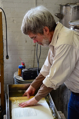
6) The sheets are dredged 10 at a time through a liquid solution of photo-grade gelatin. (In our case between 3-3.5% gelatin. [This step is done in batches of roughly 150 sheets.])

Tim Barrett submerging 10 sheets of paper in the gelatin bath. Photo: John Deason.

7) The gelatin-soaked sheets are stacked and kept under a warm-gelatin-infused felt to keep the gelatin from drying.

Tim and I stacking the gelatin-soaked sheets.

8) The sheets are pressed in a screw press to remove excess liquid.

 Tim and I placing the sized sheets into the screw press.

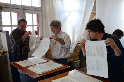
9) While the gelatin is still wet, the sheets are individually separated and gently fluttered in the air to set the gelatin. This prevents the sheets from sticking together.

 David, Tim, Gaylord, and I separating the sized sheets one at a time. Photo: John Deason.

10) The sheets are hung to dry.

Gaylord hanging the sized sheets.

 When dry, the sized sheets are rigid like potato chips.

11) The dry sheets are humidified in an enclosed area to soften the paper.

 Tim humidifying the sized sheets.

12) The softened sheets are then smoothed by hand and stacked inside a plastic bag.

 David and Tim placing the sheets in the plastic bag.

13) After which they are squeezed in a screw press for 30-60 minutes.

 Tim pressing the humidified sheets.

14) The sheets are then removed from the bag, jogged, and returned to the bag.
15) And pressed in the screw press overnight.
16) The sheets are removed from the press the next day and hung to dry.
17) After which they are taken down, jogged, and dry pressed.

Once these steps were complete, Tim put the sized and unsized sheets through a fold endurance test and found that the sized sheets endured an average of 1,528 folds before breaking, as opposed to the unsized which averaged only 351 folds.

The fold endurance tester.

With the paper sizing complete, I packed the sheets into the car and headed back east to fold and collate the books in anticipation of the whirlwind bind-a-thon we had scheduled. With each aspect of this project, speed has been a crucial element. Tim and I each believe—he with paper, and I with type design—that the element of non-Industrialized speed added a great deal of the character to which we respond in pre-Industrial books. Inspired by Tim's attempts to produce 100-200 sheets of handmade paper per hour, I designed the roman and italic typeface for the book (a revival of Peter de Walpergen's Cannon type) in sixteen hours, with no further revisions. Continuing on this theme, Maria Fredericks designed a historically inspired long stitch binding for the book, with the hope of binding the entire edition in two days. For this task we assembled a team of eight binders: Maria Fredericks, Anne Hillam, Yukari Hayashida, Nancy Loeber, Vasaré Rastonis, Gaylord Schanilec, Annie Schlechter, and me. Under Maria's careful direction, and fueled by Annie's sandwiches, the eight of us completed the seventy-nine books in sixteen hours of work.

The binding in process.

This week the books will ship out to the participants and we will all begin cooking. The goal is for each of us to cook all (or nearly all) of the recipes in the book in the space of one year, to do so with the books open on our countertops, and to annotate the recipes in the margins. At the end of the year, Annie will photograph the most interesting example of each spread and we will compile a print-on-demand facsimile.
_____
*Tim Barrett contributed greatly to the content of this post.

Friday, April 3, 2015

Broadside for Parenthesis 29

I spent part of this week printing a broadside for the deluxe copies of Parenthesis 29, the Fine Press Book Association's semi-annual journal. The print gave me the opportunity to finally work with the fonts of Aleksandra Samulenkova's Pilot typeface that I have been hoarding for the last couple of years. Pilot won the titling face category in the FPBA's 2013 Student Type Design Competition and, as part of the prize, the face was engraved and cast as a new metal typeface by Ed Rayher at Swamp Press & Typefoundry.


In addition to its dynamic letterforms, the typeface is distinguished by an extremely tight fit; qualities that together result in an unusual urgency for such a bold face. The letters practically stumble over each other trying to get to the next word.


To maintain this tight fit, Ed had to cast the type so that nearly every character kerns off the side of it's body. This makes the casting and the setting of the type a little more challenging than usual, but the results are well worth the effort. 


If you would like a copy of the broadside, join the FPBA at the deluxe level. To order fonts of the type, contact Ed Rayher at Swamp Press.