Friday, August 20, 2010
The Color of the Tiber
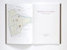
A couple of weeks ago I finished printing Swan & Hoop 2: A Roman Inscription on Santi Giovanni e Paolo al Celio. Like Mediæval in Padua before it, A Roman Inscription features a map that has been paired down to the essential landmarks that are discussed in the book. Unlike the map in Mediæval in Padua, though, the Rome map is entirely black with one red structure denoting Santi Giovanni e Paolo al Celio and a curving bluish line where the Tiber River bisects the city. All of this seemed straight forward enough until I began mixing the ink. The trouble with urban Italian waterways is that the water in them is green (or brown when it rains). This presents a host of problems when printing maps of Italian cities. I have never considered myself a realist but to print the Tiber in a bright aqua would be visually confusing to anyone who has walked along the river's banks. Despite its status as an ever flowing source of myth the Tiber is simply not blue. And therein lies the rub. To print a river in muddy green ink, however accurate, would throw off the visual balance of the map, disrupting the legibility of the image and causing the viewer to momentarily miss the point. So the goal was to make a color that is at once blue and ambiguous, evocative without being sentimental or misleading. My solution to this was to mix a blue that is actually a blue interpretation of brown, an ink composed of blue, green, yellow, red, black, titanium white, and transparent extender.
Subscribe to:
Posts (Atom)


