Tuesday, December 18, 2012

Thirteen Euclidean Propositions

I have begun work on a new project investigating and interacting with a selection of thirteen propositions from Euclid's Elements. Chosen not for their relationship to each other but for their relevance in my life, the thirteen propositions will be printed with accompanying diagrammatics and paired with a companion textual and visual commentary of my own. The book is in the very early stages of reading, sketching, writing, and proofing, but it already promises to involve the most complex printing I have attempted to date. The few spreads that I have designed so far require ten to fourteen press runs each, involving any number of materials and processes including hand set type, ornaments, rules, polymer plates, woodblock, and pochoir. The book will be hand set in my proprietary typefaces, Gremolata and Cancellaresca Milanese, newly engraved and cast by Micah Currier at the Dale Guild Type Foundry, and Daniel Kelm will be binding the book in a new structure of his design.

While many people develop a kind of nervous tick at the mention of geometry, flashing back to the schoolhouse frustrations typically associated with maths, the geometry classroom, above all others, was enormously creative for me. I was a disastrous student in general but in mathematical subjects I experienced a natural fluency, one that was tested when I entered tenth grade geometry. Frustrated with my incompetent teacher and my resulting grades, I took to reading the text book rather than paying attention in class. My grades and comprehension quickly improved and it soon became apparent that in geometry I had found my life's metier. I also discovered the method by which I would pursue any future studies: reading books and drawing. Since that first brush with geometry I have used what I learned in that text book to draw letters, design books, develop ornaments and patterns—all of the things that I love most to do.

My method for working on Thirteen Propositions is similar to my method in the tenth grade. I am beginning by reading and drawing proofs for all the propositions in Euclid's thirteen books. Along the way, certain propositions stand out as having a particular interest or relevance: they spark associations in literature, letter forms, or life (or all three). I then begin to develop visual ideas, write bits of text, and begin reading other books that might inspire or relate to the proposition at hand. My thought at this point is that each proposition will involve a work of Greek literature but it is too early to tell if that will be the case. While some of the reading is great fun, the Iliad, David Copperfield, Edith Hamilton, Euclid, etc., some is less thrilling. Just a few days ago I received a copy of a ninth grade algebra text book that sent strange shivers through my body, an uncomfortable electrical current connecting me with my awkward thirteen year old self. Thankfully, I am able to read through a chapter a day, meaning that it will be a quick torture. There are only fourteen chapters.


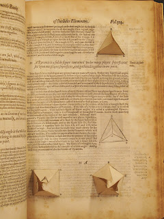
Simultaneously with these studies, I am conducting a survey of a few hundred editions of Euclid, beginning with Erhardt Ratdolt's edition of 1482 and ending with editions from the last few years. For those of you who are unfamiliar with the structure of the Elements, there are thirteen books comprising roughly twenty to fifty propositions. Each of the propositions begins with an enunciation of what is meant to be proven, followed by the proof and conclusion which are illustrated by a line diagram. These diagrams have remained constant for hundreds of years and so it is interesting to see how designers and printers have tried to distinguish their edition from others—you can tell instantly if the printer had fun with geometry or took it a little too seriously. Below I've attached just two examples. The first is from Paganius Paganinus' 1509 edition edited by Fra Luca Pacioli and it is pretty much exactly what one would expect from a Humanistic friar: tall slender columns of uninterupted text with the squares, trapezia, etc. tucked safely in the margins. The second is published by John Daye in London in 1590, showing his lovely little pull-up illustrations from Book XI. Daye's is closer to the spirit which I will try to evoke in my edition.


Monday, December 10, 2012

A preview of what's in the works


I will be announcing the book more formally in a couple of months but in the meantime here is a preview from the sketching/proofing phase of my upcoming collaboration with Euclid.

Friday, September 28, 2012

Swan & Hoop 3: A Meditation in Rome chosen as one of the 50 books of the year

My recent publication Swan & Hoop 3: A Meditation in Rome by Paul F. Gehl was just chosen as one of the AIGA/Design Observer 50 Books of the Year. You can view all of the winning books on the Design Observer website.


Thursday, August 9, 2012

Forthcoming Publication: The Book of Jonah

I am currently working on a small edition of The Book of Jonah, hand-set in my typeface Nicolas and printed on a special making of Twinrocker Handmade Paper. The story of Jonah is one to which I have returned repeatedly, though I had no specific plans to print it until I acquired a large font of Nicolas from the Dale Guild Type Foundry last year. Inspired by the twelfth century enamel lettering of Nicolas of Verdun, the letterforms in Nicolas are designed to embody a physical content as well as convey a literary one—they are spiky, voluptuous letters that would be ill-suited for most commercial book work. Cast at a large size of 24pt, the typeface would typically be considered a titling face but my intention when designing it was that it would be used for continuous text. After living with the font for a few months I began experimenting with various settings and page proportions. It quickly became apparent that Jonah was the right text for the alphabet.

The pages of the book are oblong, measuring eleven inches wide by ten inches tall, and are composed with a nod to early Biblical manuscripts. The type forms are inked in migrating shades of blue ink, conceived as a visual descent into and eventual reprieve from darkness over the course of the book. Eighty copies will be printed in advance of October, 2012.


Opening spread of The Book of Jonah.

 *    *    *    *    *    *    *    *    *    *     *    *    *    *    *    *    *    *    *    *

To sum up the story: the word of God comes to Jonah and tells him to travel from an undisclosed location to the city of Nineveh and cry against its wickedness. Instead, Jonah flees to Joppa and boards a boat for Tarshish. God sends down a mighty tempest striking fear into all but Jonah, who is sleeping down below. The sailors draw lots to discover the cause of the turmoil and the lot falls upon Jonah who, after telling his story to the sailors, suggests that he be tossed overboard so that the sea will be calm. Rather than take Jonah's life, the sailors try unsuccessfully to row to shore, after which they beseech God to neither kill them nor make them kill Jonah. God remains implacable. The sailors pitch Jonah over, the sea becomes calm, the sailors make sacrifices and vows.

Meanwhile, below, God has prepared a great fish to swallow Jonah up. While in the belly of the fish, Jonah offers a prayer as if he had already been released from the fish, pledging to hold true to his vows. After three days and three nights, God has the fish vomit Jonah onto shore.

Once again the word of God comes to Jonah, commanding him to go to Nineveh and preach against it, which he does in a remarkably terse manner: "Yet forty days, and Nineveh shall be overthrown." Message received, all the inhabitants, king and peasant alike (and their livestock), cover themselves in sackcloth, refrain from food and drink, and cry to God, promising to turn from evil and violence. Seeing their sincerity, God repents of the evil he has said he would do to them and spares Nineveh his wrath.

Contrary to expectations, Jonah is beside himself with anger, saying that he fled to Tarshish initially because he knew that God was gracious and merciful and would repent his evil pledge. In a peculiar narrative leap, Jonah then beseeches God to take his life from him. God refuses and Jonah sets up a "booth" outside the city walls so that he might see what will become of Nineveh. God causes a gourd tree to grow to provide Jonah with shade, only to set a worm to destroy it the following night. He then causes a blistering sun and hot wind to beat upon Jonah until he faints with heat and prays for death. To this prayer, God responds that if Jonah should pity the gourd ought not the Lord pity the people of Nineveh and their cattle? Here the book ends.

Although the bit about the belly of the fish gets all the press, the central narrative conflict of The Book of Jonah concerns Jonah's reaction to the call to prophecy. It is not a simple reaction. First he flees from God's sight and displays no signs of regret for having disobeyed Him, easily sleeping while the tempest roils around him. (Later we learn that Jonah's equipoise may have derived from his belief that God would not commit "the evil" against Nineveh anyway, so Jonah's services as prophet were unnecessary.) When called the second time, Jonah enacts God's commandment with a minimum of effort and then cries angrily that his evil prophecy was not fulfilled (if that is, in fact, why he is angry). First you have me swallowed by a fish, then you make me trudge all the way out here to tell these people that you are going to destroy them, and then you don't destroy them! Just kill me now!

Despite these convoluted scenarios it is hard to believe that The Book of Jonah is really about Nineveh at all. Or more precisely, if the purpose of the prophecy is to instruct Nineveh, there is no story to tell—one little peep from Jonah and the whole city mends its ways. The story is all action with little or no character development, two odd prophetic tales tenuously balanced on the fulcrum of Jonah's transformative experience in the belly of the fish. The real narrative cargo of The Book of Jonah is how Jonah learns (or can learn) from his own prophecy.

 *    *    *    *    *    *    *    *    *    *     *    *    *    *    *    *    *    *    *    *

As with all Biblical books, each careful reader of The Book of Jonah has their own interpretation or point of access. When I read the text, I interpret it as a parable for the transformation from adolescence to adulthood. The stage for this reading is set in the first chapter when the lot falls upon Jonah and the sailors interrogate him thus: Tell us, we pray thee, for whose cause this evil is upon us; What is thine occupation? and whence comest thou? what is thy country? and of what people art thou? These formative existential questions set a tone for the succeeding narrative: who are you? what do you believe in? Each character in the story, including God, is called upon to answer these questions through their actions. Throughout the text, Jonah vacillates between cluelessness and insight, blithely ignoring God's will one moment, displaying a near-omnipotent understanding of God's limitations the next. What better model of an adolescent is there than one whose lack of worldly understanding is shot through with occasional flashes of native wisdom? Jonah's reactions to God's commandments, in all their petulance and pluck, are the reactions of a child, and the lessons he is learning are necessary for his transition to adulthood. Chief among these lessons is empathy. Jonah's early willingness to sacrifice his life for those of the other sailors, the sailors' attempts to row to shore rather than kill Jonah, Jonah's (enforced) comparison of his own plight with those of the people of Nineveh, God's empathy for Jonah (preparing the fish as passage to shore) as well as for the people of Nineveh—all of these episodes illuminate a central theme of the story, the extreme brevity of which deprives us the satisfaction of knowing whether these lessons bore enduring fruit. Maybe Jonah learns important life lessons. Maybe he just goes on sulking, being angry unto death.

And then, of course, there is the fish. The fact that Jonah was in the belly of the fish for three days and three nights prior to being regurgitated onto dry land provided a deeper prophetic resonance to the story for early Christians. While that particular reading does not resonate with me, the less loaded idea of a transformative second chance does. For all of its drama, The Book of Jonah is a hopeful text in which even God reconsiders his actions and repents for his wrongdoing. Transformation waits at the ready as a perpetual Plan B, suggesting a more nuanced reality than simplistic tales of good and evil typically allow.

Friday, August 3, 2012

Midwest Craft Pilgrimage: Oxford, New York*


For the contemporary fine press printer, paper presents a host of difficulties. In my own work I have vacillated between emphasizing and de-emphasizing the substrate, from commissioning self-consciously handmade papers to using the most unassuming commercial sheets. In the end, neither has fully satisfied me: both styles of paper embody a physical sub-narrative that is often at odds with both my printing æsthetic and the primary narrative of my books. Ideally, these are the attributes that I am looking for in a handmade sheet: good printability of both type and images requiring a minimum of pressure; light surface sizing; a handsome drape when bound; and a pleasing “rattle” or “snap” when handled. The printability and snap are, in turn, related to an inner density, a hardness that encourages ink to release and lines to stay crisp.

There is a distressing softness to many contemporary hand- and mould-made papers and this softness creates problems when making a fine book: soft papers require more pressure for ink to transfer; the additional pressure increases paper stretch which makes tight registration more difficult or impossible; the paper damages easily in the printing as well as during and after binding; and, in an effort to compensate for these qualities, many softer papers are made too thick, which interferes with the action of the bound book. From my brief collaborations with Dieu Donné Papermill in the 90s I attribute the relative softness or snap of a paper to the fiber choice and beating time used to prepare the pulp. My assumption, therefore, has been that my ideal paper formula would be found by tweaking these factors until I got them right.

When I posed these various concerns to Tim Barrett at the University of Iowa his take was quite different than mine. As detailed in my earlier blog post on Iowa City, Tim suggested that the sizing is a critical feature in determining both the snap and the longevity of a paper. When I brought up the negative impact of surface sizing on printability Tim responded that there is an historical precedent for me to add sizing after printing. To test his theory, I sent Tim some prints on Velke Losiny paper from which I had soaked most of the sizing. Tim re-applied a 2.5% sizing solution to the sheets and, to my surprise, the process not only added considerable snap to the paper, it did not damage the color or quality of the prints. This approach—adding sizing after printing—would be a tempting solution to the issue of snap were it not for two critical problems: 1) the thought of putting my printed sheets through an additional process would run the risk of driving me mad with worry, and 2) although post-press sizing addresses the æsthetic aspect of paper snap in the finished book, it does not address the functional purpose of snap during printing. Regardless of when I size a paper, from the perspective of printing I need to first deal with that paper’s fiber and its preparation.

Paper can be made from many different fibers but the primary ones for my consideration are cotton linters, cotton rag, linen rag, flax, and abaca. To oversimplify: the longer you beat fibers the more rattly, translucent, and hard the resulting paper will be. This is especially extreme in linen, flax, and abaca pulps. With any fiber there is a threshold beyond which the positive aspects of longer beating become detrimental to the finished sheet; too much snap or hardness produced by longer beating can impede the printability or action of the paper, and the more translucent a paper is the fewer printing options it can accommodate.

To further complicate matters, I have come into this project with an (unsubstantiated) bias against the use of cotton linters, a bias informed largely by the fact that the historical handmade papers I most admire were made using linen rag. When you compare the 100% linen rag Kelmscott papers that the Batchelor mill made for William Morris to many sheets made from cotton linters, there is no real comparison. While some cotton papers are sensorially evocative or have a tantalizing drape, linen papers are distinguished by an inner hardness that naturally lends itself to letterpress printing. The ink wants to transfer from the printing surface to the paper. This does not necessarily mean, however, that using 100% linen rag is the solution to my paper dilemma. For instance, I recently acquired a small stack of Batchelor’s Crown and Sceptre paper and, while the paper does indeed cry out for printing, it does not cry out for my printing. The paper’s inner hardness requires that, for proper dynamics, the sheets be comparatively thin. The printing techniques I have been using in recent years would show through too much for the Batchelor paper to be a good choice for one of my books. Instead, my hunch has been that I need a paper composed of both linen and cotton pulp, counterbalancing the native hardness of linen with the flexibility of cotton.

As a first step in testing this hunch I contacted my friend Mina Takahashi and asked if she would spend a couple of days experimenting with me on her farm. I first met Mina in 1990 at a book arts conference in New York City. She was the freshly-minted Executive Director of Dieu Donné Papermill and I was manning (or boy-ing) the table of the New College of California Press. I had been printing for about six months and I spent a good deal of the conference quizzing Mina about Dieu Donné’s papers and mauling the samples she had to show. Shortly after moving back to New York in 1993, I took an introductory papermaking class at Dieu Donné and quickly became a kind of hanger-on at the mill. Although papermaking didn’t stick with me, Mina and I have been collaborating on one thing or another ever since.

About four years ago, Mina and her husband Marco Breuer moved to Oxford, New York to set up a self-sustaining, organic farm. Since then the enterprise has grown to involve fifty chickens, a few ducks, a milk cow, two calves, three draft horses, a shitake mushroom farm in the pinetum, planting fields, and a small paper studio tucked in a corner of the dairy barn. Like all of the people we have visited on this trip, I have been trying unsuccessfully to get to Oxford for years. Unlike the other people we have visited, though, the only way to see both Mina and Marco is to go to them—as an operating farm there is too much to be done for them both to leave the property.

In advance of our visit I sent Mina some samples of different papers that possessed qualities I wanted to pursue or avoid and we had a few discussions about possible fiber choices. Wanting to keep things relatively simple we decided to experiment with linen rag, an old cotton tablecloth, Twinrocker 89 (a sheet-formed, semi-macerated cotton rag), and Twinrocker 290 cotton linters. The fibers were prepared as follows:

Cotton Tablecloth:
1)   Washed with Borax
2)   Cut into ½” squares with rotary blade
3)   Soaked for two days
4)   Beaten for total of six hours
5)   3% solution of calcium carbonate added

Linen Rag Selvage
1)   Cut and soaked overnight
2)   Cooked in 20% soda ash for one and a half hours at strong boil followed by three hours simmer; rinsed and soaked overnight
3)   Beaten for a total of three and a half hours
4) 3% solution of calcium carbonate added

Twinrocker 89
1)   Soaked for one hour
2)   Beaten for a total of one and half hours
3)   3% solution of calcium carbonate added

Twinrocker 290 Cotton Linters
1)   Soaked for thirty minutes
2)   Beaten for thirty minutes
3) 3% solution of calcium carbonate added

To describe Mina’s paper studio as small is a bit of an exaggeration, tiny is more accurate. The room is large enough to accommodate the beater, vat, press, and small table required to make paper, but two people at work would push the space to its limits. So, prior to our arrival, Marco put up a shade tent on the lawn to give us a little extra room to pull and couch the sheets en plein air. The last time I pulled a sheet of paper was in 1994 in the Dieu Donné studio on Crosby Street, a cramped, damp place lodged between sweat shops on the edge of Chinatown. By contrast, the set up in Oxford was an Arcadian dream, made only slightly less idyllic by the constant chores upon which the farm depends (chores that Annie gladly assisted in and to which I, by contrast, applied my lifelong maxim: stay out of a worker's way).

I have never, since my first dabbling at Dieu Donné, seriously entertained making my own paper. I already have enough to concentrate on doing and, in thinking about the aforementioned damp New York City loft, it has been hard for me to see the attraction of dipping in and out of a cold vat of water all day. For the first time in Oxford I understood why people would go through the trouble. As you rock the mould from side to side and front to back, there is a moment when, all of a sudden, you see the sheet form. The dissolute fibers interlock and, in the suspended water trapped in the deckle, the porous congregate of fiber becomes a contiguous whole. It is a small epiphany that tells you when to stop moving and it is charged with the same creative excitement I experience pulling a good print. It was almost inspiring enough to make me set up a paper studio....

Over the course of two days Mina and I pulled sheets using a variety of fiber combinations and, true to my suspicions, I felt immediately drawn to the sheets composed of Twinrocker 89 and Linen Rag. A few weeks after returning, Mina shipped me the dried sheets for printing tests. On each paper I printed a solid area of color, a halftone, large and small type (all from polymer plates), and a form of foundry type. No self-evident IDEAL PAPER made itself known and, at best, my tests were inconclusive. The sheets made with linen in them required, in general, less ink and revealed less show through than the purely cotton sheets. The sheets made with 75% Twinrocker 89 and 25% Linen had the added pleasing qualities of snap and drape. Despite these initial results, the only way to test them will be to commission a larger making of sheets and go to town.

*I realize that some people might take issue with me referring to Oxford, New York as the mid west but I think there is a reasonable argument that the eastern border of the mid western United States is the Hudson River.

 Mina and I in the studio.

 The vat and couching table.

Forming the sheet.

 Couching the sheet.

 Cleaning the deckle with dog and horse.

 The stack.

 Annie assisting Marco with watering.

 Mina and I transferring the pressed sheets to the drying system.

Comparing notes over much-deserved gin and tonics.

Tuesday, May 22, 2012

Midwest Craft Pilgrimage, Part 2

Tomorrow morning Annie & I head out on the second leg of our Midwest Craft Pilgrimage. First stop is Oxford, New York where we will spend two days making paper on Mina Takahashi and Marco Breuer's farm. From Oxford we will wind our way up to Shanty Bay, Ontario for pochoir lessons with Walter Bachinsky and Janis Butler of Shanty Bay Press. From there we will slip back down to the lower 48 for two days of hand press printing with Bob and Freddy Baris at the Press on Scroll Road. Propelled by the intoxicating vapors of craft immersion we will plow onward to Chicago where I will be giving this year's American Printing History Association Lieberman Lecture at the Newberry Library.

Sunday, May 13, 2012

Midwest Craft Pilgrimage: Stockholm, Wisconsin

After breakfast in Decorah we headed for Stockholm, Wisconsin to visit Gaylord and Brenda Schanilec. Gaylord is a wood engraver, letterpress printer, maple syrup maker, and fisherman who's books draw their unique power from a close examination of his natural surroundings, a method Brenda refers to as playful science. In two of Gaylord's recent books, Mayflies of the Driftless Region and Sylvæ, he has treated the observation of the mayflies he uses for fly fishing or the trees on his property as his starting point, and allowed the content of the book to grow and gather around his findings. For his current multi-volume work titled The River he is engraving specimens of fish and mussels that he catches in Lake Pepin, a natural swelling of the Mississippi River near his home in Stockholm. For this purpose he has outfitted a motor boat with an observation tank, a drawing table, a small library, and a cabinet for his camera equipment. His goal is to eventually catch every species in the lake. As he collects, records, and engraves specimens for the first volume, he simultaneously collects historical narratives about Lake Pepin. The various passages he gleans from these narratives will form the text of the book. Although our work is very different, I feel a great affinity for Gaylord's process—Sylvæ made me first consider appending notes to my alphabetical works.

Gaylord can engrave on wood with more delicacy than I can draw with ink and this entire trip grew out of my desire to take an engraving lesson with him. When I first brought the idea up he said, "I can show you how to use the tools but I can't imagine you'll want to invest the time to become an engraver." While it is true that I am not interested in making traditional wood engravings using what Gaylord calls the "flurry of lines" technique, I am interested in involving more autographic processes in my work. As long as I know one of the greatest living wood engravers, I might as well learn to use the tools from him. The engraving lesson, though, was only part of the draw to visit Stockholm. Every year or two Gaylord comes for a visit to stay with us in New York and I have come to regard him in an urban setting. He talks about cutting down trees or catching mayflies but his stories remain abstract. I have never seen him in his native surroundings. His description of his property as being two miles from a town of 80 people is not something I can easily visualize. Similarly, when Gaylord began work on the River project I told him that I used to do a lot of fishing when I was a kid. I don't think he believed me. Our knowledge of each other was limited by urban settings—it was time for a visit.

Winding our way north through Iowa, both Annie and my cell phones lost reception at the Minnesota border (perhaps that's what they mean by "driftless region"). Gaylord had suggested driving up the river on the Minnesota side and then crossing into Wisconsin at Wabasha or Winona. Shortly after merging onto routes 14 & 61 in La Crescent, Annie pointed out the passenger window and said "That's a really big bird." I turned my head to see an enormous bald eagle keeping pace with us. Somewhere just north of La Crescent we had crossed the less clearly marked border into Oz. My excitement at seeing a bald eagle in flight was soon tempered when I noticed that they were everywhere—sitting in trees, circling high above, criss crossing their feeding trough, the Mississippi. After the fourth or fifth eagle sighting I had become jaded enough to wonder if the bald eagle is to the Minnesotan what the pigeon is to the New Yorker.

With an hour or two to spare before we were scheduled to arrive in Stockholm, Annie and I decided to lunch and take in the sights of Wabasha, Minnesota. Entering the town limits we learned that Wabasha was the location of the film Grumpy Old Men, suggesting that the iconic scenes of ice fishing from said movie may have been filmed on what I had  thought of as Gaylord's lake. Prior to arriving, Annie had queried the town on her iPhone and discovered that, in addition to our various dining options, Wabasha was home to the National Eagle Center, a sight not to be missed. After a delightful lunch of grilled cheese, salad, and Cheesy Chicken Tortilla Soup at Stacy's Kitchen, we trudged through the rain to the Eagle Center. I had assumed the Center would consist of a series of dramatic dioramas, patriotic soundtracks along the lines of "American by birth, Harley rider by choice", and some pay-as-you-go binoculars, but the first thing I saw on entering the Center was a young woman with a gigantic eagle perched on her hand. I suppose I should have been excited but my first impulse was to flee. In a contest of strength or will, I would surely be defeated by such a bird. Is it even legal to keep a bald eagle captive? I steeled myself, paid the $16 entry fee for two and cast myself into the fray. The picture below will give you a good idea of what I look like when I think my eyeball is about to be plucked out by a huge, predatory bird.


Quitting Wabasha, we crossed over into Wisconsin. The river bridge eases into a causeway on the Wisconsin side and travels through a diverse wetland, with shaded eddies, tall grasses, and verdant trees arched above secret pools. Just like my experience in Iowa, I didn't know what to expect but my expectations were wrong. When we hit solid land in Nelson we paid "Smiling Bob" a visit at the discount liquor store and picked up a bottle each of Santa Margherita Chianti and Knob Creek bourbon as house gifts. At the checkout counter I noticed a bottle of maraschino cherry-colored liquor called "Ice Hole" with a surprisingly moderne label. We chose not to sample it but I bet it has kept a lot of solitary ice fishermen company in their shacks. After a bit of a drive, we passed by the designated turn off at County Road JJ in favor of touring through the town of Stockholm. To our surprise, the town sign listed the population at 66 rather than the oft-remarked 80.


Gaylord and Brenda's land is perfect for an artist in the same way that it is probably all wrong for a farmer. Their house and out buildings are perched on the peak of a hill from which their property falls away into a ravine. There is just enough flat land for the four buildings, a kitchen garden, a small orchard, and a regulation tennis court. Grading downward in all directions are their woods. In addition to being the source of his book Sylvæ, the woods are where Gaylord taps his syrup trees (a distant cousin of the money tree) and where he and Brenda go morel hunting in the spring. Prior to arrival, Gaylord made it clear that a morel hunt was in the offing. Of the four buildings on their property, one houses a printshop, one a wood working shop, and one exists solely to store and kiln-dry wood. Gaylord's printshop is roughly six times the size of mine and, as is true for all printshops, it is just a little too small to fit that one last piece of equipment.

Gaylord's wood loft.

The next morning we set to work. I'm a little embarrassed to say that I had never seen someone engrave in wood before our lesson. In all of our conversations about engraving, Gaylord has been insistent that he can only teach me how to hold the tools, the rest is practice. What I found most informative about the lesson, though, was watching the pace with which Gaylord works with those tools. I have always imagined that the fine white lines of wood engravings are made with a continuous, fluid movement, making the precision with which people like Gaylord engrave seem otherworldly, or at least unattainable. Instead, the process is extremely slow and measured, each line engraved one tiny bit at a time. In many ways the pace reminded me of complex vector drawing on the computer, though of course with very different results. Every time I began to cut I had to check myself to slow down. After thirty minutes of messing around, Gaylord showed me how to shorten the gravers to the correct length, packed up a selection of his homemade wood blocks for me to practice on, and began getting the boat ready. The lessons I will be taking on this trip will be concise sessions that I will follow up in correspondence. Since returning to New York I have begun engraving a block and as I progress I will proof it and send prints to Gaylord for comment.

 Gaylord showing me how to hold the graver.
 Master and student at work.
Gaylord engraving.

Next we set out for Lake Pepin for an expedition on the boat. Since Gaylord began work on The River I have been hearing certain names recur—Lake of Tears, Point au Sable, and Point No Point—names that seem more likely to pepper the notebooks of Meriwether Lewis than the blog of a friend of mine. Point No Point has been a particular curiosity to me. It is such a graceless name that I cringe every time I hear it, making me want to see it all the more. True to form, it was fascinating, the only true geological tropme l'oeil I have ever seen. Motoring north up the lake after a brief mussel hunting excursion on Point au Sable, Point No Point came into view and remained, without ever changing shape, as we progressed up river. The point never came to a point but always looked like one. Until, suddenly, we crossed the perspectival barrier that revealed the point for the gentle bend that it is. Crossing the lake to the Wisconsin shore, Gaylord set me up with rod and reel and nearly fell off the boat with disbelief when I actually caught a fish: an enormous white bass that is sure to be a record breaker.

 Gaylord on the boat.

Casting a line.

Un-hooking the record-breaking bass prior to release.

The next day it was time for the hunt. Brenda had made fresh morels for dinner on both nights of our visit thus far and the stocks were getting low. I have never met a serious book person who does not also love food and there are few more appropriate activities for printers to engage in (when not printing, of course) than to hunt for food. In fact, for many printers it seems that printing is what one does to fill in time between eating. After tooling around the shop all morning, Gaylord, Brenda, Annie, the two dogs, and I packed off to hunt the elusive mushrooms.

The hunters.
The quarry.
The kill.

To cap our visit off, Terry Belanger, Director Emeritus of Rare Book School, and Dan DeSimone, Rosenwald Curator at Library of Congress, just happen to be visiting the bookseller (and Gaylord Schanilec bibliographer) Rob Rulon-Miller in St. Paul. They drove down for a studio visit and to join us for dinner at Pepin, Wisconsin's world famous Harbor View Restaurant. After a sizable and delicious serving of food, Annie and I turned in to bed for our last night in Stockholm.

 Rob Rulon-Miller and Terry Belanger looking at books in Gaylord's printshop.
Dan DeSimone and I deep in conversation.

Thursday, April 26, 2012

Midwest Craft Pilgrimage, Iowa City to Decorah

Leaving Iowa City on Wednesday, we took an hour's drive due west to Grinnell to have breakfast with Bruce Whiteman and Kelly Maynard. When we arrived, Bruce was in full cooking mode, tending a pan of herby thirty-minute scrambled eggs that, when served, blew our collective minds. (Farm fresh eggs have become a competing sub-pursuit of this trip. Each new freely-laid egg that we consume is accompanied by tales of the One-That-Has-No-White, the egg that is little more than a tumescent orange-yellow yolk. To experience this much-remarked Ideal Egg has lodged in my mind as one of life's lofty goals.) After sopping up the last of our breakfast we looked at books for an hour before heading back on the road, winding our way north east through the Iowa countryside to Decorah. I have never been to Iowa before this week and prior to arriving I had a hard time conjuring an image of what we would find. At every turn the towns, the landscape, the food, and the people have primed our visit with delighted surprise. In conversations with other visitors the most frequently mentioned feature of the Iowa countryside is "CORN!" but in mid April the fields are just being planted, meaning there are no corn rows to obscure the view. Driving through Iowa at this time of year is to be enveloped in a variegated pastiche of brown, chamois, and a thousand different greens, punctuated with red barns and blue or silver silos, light-gray grain elevators, green and yellow tractors, brown black and white livestock, gamboling deer and red wing blackbirds, all arrayed against a plan of man-made vertices, softened by the gently rolling fields. Iowa is a beautiful place, with or without the eggs.

Annie and I on the road in Iowa.

Chamois, green, brown.

The goal of the day was to visit David Esslemont and his family in Decorah. David is an artist, letterpress printer, book binder, and contract farmer who has been making a series of calligraphic paintings, or calligrams, in recent years. I first met David in San Francisco in October 1990 when, at Joyce Wilson's behest, I picked him up from the airport. David was visiting from Wales and was scheduled to address the Colophon Club as part of an extended stateside tour. I was barely nineteen years old at the time and I took an instant shine to David—he was passionate and fun and he referred to his Heidelberg cylinder press as the "Rolls-Royce of presses," rolling his "R"s a little too long for emphasis. At the time he was in charge of the historic press, Gwasg Greynog, and his tales of the Welsh countryside filled me with romantic visions. After a few days as his informal San Francisco tour guide I did not see him again until 2007 when, at the CODEX Book Fair, I heard the same rolling "R" when he asked over my shoulder "Is that young Russell?" Since I had last seen him, David had left Gwasg Gregynog and moved to Decorah. As we corresponded after our reunion, the stories and pictures of David's new home conjured similar bucolic images as the stories he told me of Wales nearly twenty years earlier. Few stories attracted me as much as those of the wood-burning pizza oven he and his son Tom had built from the mud of his fields.

Immediately upon arrival in Decorah we set to "work." Through a lazy afternoon we stoked the pizza oven, played a little soccer, took a walk around the property, looked at books, drank wine, and eventually sat down to eat trout pate on home made bread, David's award-winning chili, beautiful lettuce greens, and fresh pizzas.


 The next morning we gathered some eggs from the hen house, ate breakfast, and hit the road for Stockholm, Wisconsin.


Friday, April 20, 2012

Midwest Craft Pilgrimage, Day 2

We began the day with home made bread, jam, and local farm eggs at the Brown Street Inn before being picked up by Tim Barrrett to visit the University of Iowa's Oakdale paper research facility; a component of the UI Center for the Book. Although the primary reason for my visit to Iowa City was to enroll the Book Arts students in the Fine Press Book Association, I have been eager to meet Tim and get his insights into some of my handmade paper issues. During the making of Specimens of Diverse Characters, which I printed on Velke Losiny's beautiful cotton paper, a number of unforeseen problems arose due to the variety of processes I put the paper through. I have used handmade paper on a number of books in the past but I had never asked so much of a single paper as I did in Specimens. The principal issues I encountered dealt with the amount of surface sizing on the virgin sheets and, after successive dampening, the lack of remaining sizing. Before dampening, the sized paper received large areas of ink coverage surprisingly well but fine lines, particularly in smaller sizes of type printed from photo-polymer plates, looked slurry and experienced an unacceptable level of ink gain. The gelatin sizing also, as was apparent after dampening, imparts a somewhat plasticine surface to the virgin sheet that is less attractive and tactile than the surface that appears after dampening. After dampening, the paper, however beautiful in texture and touch, lost a good deal of the "rattle" (typified by an inner density and a pleasant snapping sound when flicked between the fingers) that is helpful for ink transfer and reminiscent of the older, classic handmade papers that I love.

Tim and I looking at a stack of dried sheets at the Oakdale facility.

Before meeting with Tim I assumed that the issue was one of too much surface sizing over fibers that were too short, like those found in short cotton linters, or fibers that were not beaten for a long enough period of time. Tim's researches, though, have revealed that a significant amount of classic handmade paper's hardness and snap derives from the use of gelatin sizing and that the sizing also contributes to the paper's durability and stability over time. Of particular interest in his recent research was the discovery that there was considerably more sizing in 15th century papers than there was in paper in subsequent centuries. Gary Frost informed Tim of Szirmai’s assertion, backed up by historical references, in his The Archeology of Medieval Bookbinding, that many 16th century printers were ordering un-sized waterleaf sheets and that the sizing was added after the printing. The post-press addition of sizing would make the papers more durable for binding and more resistant to ink-bleed when people wrote in the margins. This is interesting to me because it relates to my experience of the Losiny: I needed the lack of sizing for the paper to print the way I wanted but afterward I would have liked some (not all) of the physical attributes that the sizing imparts to the finished sheet. When Annie and I return to New York I am going to send Tim some of the rejected sheets from Specimens to experiment with re-applying gelatin sizing.

The loft drying system (above) and fiber cook pots (below) at Oakdale.


After visiting Oakdale, Tim brought us back to the campus to meet up with Sara Sauers for a tour of the Center for the Book. Sara teaches letterpress printing at Iowa, has her own press (check out her new book for the Folger Shakespeare Library, Shakespeare's Sisters), and was the person with whom I arranged the visit. The Center for the Book facilities are built into the North Hall, a former secondary school that has been cleverly re-purposed, most notably the former men's locker room which is now the wet floor of the student papermaking studio. We took a look around, met and re-met up with other instructors at the Center—Emily Martin, Sara Langworthy, Gary Frost, Lauren Faulkenberry, and Julie Leonard—and then got together with the students to show some books and talk about the FPBA. As has been my experience at the other university programs I've visited so far, the Iowa students are engaged and serious. Before I began visiting MFA Book Arts students last fall I was worried that the proliferation of academic book arts was going to be a passing fad. Instead, with each one I visit I am more hopeful for the future of the handmade book. The remainder of the day was divided between various dining experiences with Sara, Sara, and Tim.

Sara Sauers and I at the student printshop at North Hall.

Showing books to students in the student papermaking studio at North Hall.

Monday, April 16, 2012

Midwest Craft Pilgrimage, Day 1


Today we head off on the first leg of our Midwest Craft tour, flying first to Cedar Rapids, Iowa and heading on to Chicago via Iowa City; Decorah, Iowa; and Stockholm, Wisconsin. Along the way Annie and I will visit with the MFA Book Arts students at both the University of Iowa and Columbia College, Chicago; drop in for breakfast with poet Bruce Whiteman; spend an evening with artist, printer, and farmer David Esslemont; take a wood engraving lesson and go fishing with Gaylord Schanilec; visit Paul Gehl at the Newberry Library; and dine with a group of Chicago book people at Robert McCammant’s house. At the end of May we will finish the tour with a drive from New York City to Chicago, visiting Mina Takahashi and Marco Breuer in Oxford, New York; Walter Bachinsky and Janis Butler in Shanty Bay, Ontario; Bob and Freddy Baris in Carrollton, Ohio; and ending up back at the Newberry Library for a weekend of events surrounding the American Printing History Association’s Lieberman Lecture.

The purpose of the road trip is to learn from craftspeople who are proficient in a technique in which I have little or no practical experience: wood engraving, pochoir, papermaking, and hand press operation. I am not setting out to try to master any of these crafts but to understand them better, in the hope of broadening what is possible in my own craft. As with any niche community, private press printers are spread out over a large geographic area and, more often than not, tend to live in rural settings. For a New Yorker it is not easy to connect for long periods with other printers. To study with them and to see how they integrate their craft with their lives, you have to visit them in their natural habitat.

Our first stop is the University of Iowa Center for the Book. Tonight we'll gather with faculty and students at Sara Sauer’s house. Tomorrow, we’ll take a tour of the papermaking and printing facilities and meet with the students.

On the plane wearing the optivisor.

 Clouds
Annie with bears at the Minneapolis St. Paul Airport.

Saturday, April 14, 2012

Midwest Craft Pilgrimage

On Monday, Annie & I set out on the first leg of our self-styled, midwestern craft pilgrimage. Arriving in Cedar Rapids on Monday afternoon we will proceed directly to Iowa City for an informal gathering at printer Sara Sauer's house. The next morning, papermaker Timothy Barret will pick us up and give us a tour of his state of the art hand papermaking facility. From there we will tour the University of Iowa's Center for the Book & meet with students in the MFA Book Arts program.

On Wednesday we will drive up to Decorah, Iowa where we will spend the evening with artist, printer, and prize-winning chili cooker David Esslemont and his family. Last year, David and his son made an outdoor adobe pizza oven & one of our objectives (perhaps our primary objective?) is to obtain plans and advice on how to build one for ourselves.

Thursday morning we will head on to Stockholm, Wisconsin for three days with Gaylord and Brenda Schanilec. While there, Gaylord will give us a two day lesson in multi-chromatic wood engraving and, weather permitting, we will spend the third day on his floating observational platform (ie. boat) in Lake Pepin.

Next stop is Chicago for a few days with Paul Gehl and Rob Carlson, a visit with Inge Bruggeman and the students at the Columbia College Center for Book and Paper Arts. A final dinner with Bob McCammant of Sherwin Beach Press ends leg one of the tour.

Tuesday, February 14, 2012

Gremolata and Cancellaresca Milanese Launch

I launched the kickstarter campaign this morning. If successful, Micah Currier and I will convert my typefaces Gremolata and Cancellaresca Milanese into a new proprietary type family comprising over 185 different characters and ligatures. Any support you can give will bring us closer to our goal.


Monday, February 6, 2012

Gremolata and Cancellaresca Milanese

In a couple of weeks I will be launching a Kickstarter campaign to raise money to have Micah Currier at the Dale Guild Type Foundry cut and cast my typefaces Gremolata and Cancellaresca Milanese as a new proprietary metal type family. Here are a couple of pictures of the digital predecessors of the typefaces in action.


Tuesday, January 31, 2012

Thoughts on Making New Metal Type

Annie shot this video during my conversation with Gaylord Schanliec and Jane Siegel at the Center for Book Arts, New York. It gives a good sense of my motivations in turning my digital typefaces into new metal type.