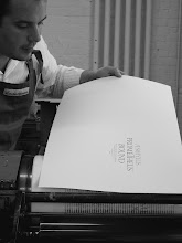
In addition to its dynamic letterforms, the typeface is distinguished by an extremely tight fit; qualities that together result in an unusual urgency for such a bold face. The letters practically stumble over each other trying to get to the next word.

To
maintain this tight fit, Ed had to cast the type so that nearly every
character kerns off the side of it's body. This makes the casting and
the setting of the type a little more challenging than usual, but the
results are well worth the effort.

If you would like a copy of the broadside, join the FPBA at the deluxe level. To order fonts of the type, contact Ed Rayher at Swamp Press.